Mobile trends
5
January 16, 2024
Share


New Z2A Digital branding: the journey
At Z2A Digital, we're excited to unveil our new branding, a reflection of our continuous growth while maintaining our essence of fun and scrappiness. This evolution in our brand identity aligns with our stage of growth, signaling our commitment to both our clients and our playful, innovative spirit.
Why the Change?
Our new branding is more than just a visual makeover; it's a strategic move to mirror the company's development. We're not just a startup anymore; we're growing, hiring, and scaling, yet we've managed to retain our scrappy, dedicated approach. Our objective with this rebranding is to present a mature yet fun image that resonates with our diverse clientele.
The Essence of Our New Branding
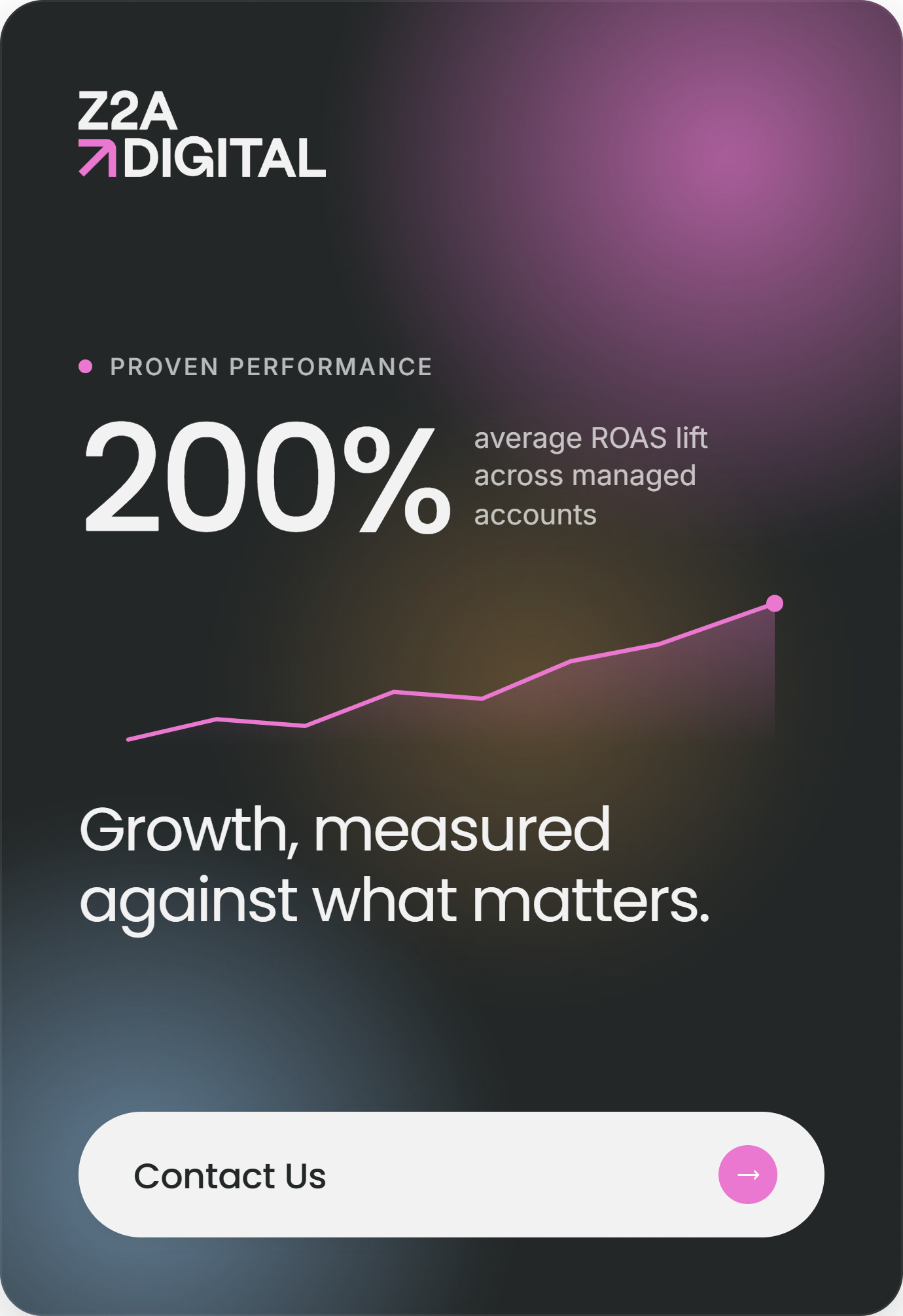
Our new tagline, "We do more," alongside the up-arrow in our logo, is at the heart of this rebranding. This mantra and symbol perfectly encapsulate our dedication to driving growth for our clients, whether it's in the form of more traffic, more installs, more registrations, or more revenue. The playful arrow hidden in the 'G' of our logo is a subtle nod to our continued commitment to having fun while helping our clients grow.
The Z2A Digital brand style is an eclectic blend that strikes a balance between retro vibes and modern professionalism. We've combined fun, colors, warmth, and modernity to create a style that speaks to both serious solution-seekers and those ready for a collaborative journey to great results. At our core, we remain dedicated to thinking differently about mobile marketing, a crucial aspect of our identity.
Design Elements: A Nod to Our Roots and Vision
In our design, we've embraced subtle grainy textures, blur effects, and playful compositions, which bring a human element to our brand. The retro synthwave feel, a beloved aspect of our previous branding, remains through our choice of colors, blending pinks and blues with other bold choices. This continuity ensures a seamless transition for our clients and partners.
The logotype is minimalist and clean, with the logomark representing the essence of our tagline – “We do more.” The up arrow is a simple yet memorable mark that aligns with our company DNA. Complementing this, the text part of the logo employs a human serif, where the letter 'G' mimics the arrow shape, creating a stronger connection with the logomark.
Color Palette and Typography: Reflecting Our Uniqueness
Our color palette is a combination of muted neutrals and bright accents, avoiding harsh, saturated colors while adding a fun, innovative vibe. The range of gradients available works perfectly with geometric shapes, adding depth to our visual identity.
In typography, we use PP Mori SemiBold for the logotype and Poppins for titles, ensuring consistency across all our materials, from our website to graphic designs.
Geometric Compositions: Symbolizing Our Approach
Our use of colorful geometric compositions, made of squares and rectangles, serves various purposes, from abstract illustrations to fun accents or dynamic backgrounds. These patterns, with their repeating yet interrupted sequences, symbolize our non-conformist approach to app marketing.
A Unified Vision Moving Forward
As Vlad Migulia from Unikorns design agency, who we worked with on this project, puts it; "Z2A's brand identity and website were like a gulp of fresh air for our team. We are delighted to help their team achieve new heights in brand awareness by crossing creative conventions."
This new branding is not just a visual update; it's a comprehensive reflection of our growth, our dedication to innovation and fun, and our unwavering commitment to delivering more for our clients. Welcome to the new era of Z2A Digital – where we continue to turn things on their head and achieve remarkable results.

Ready to think differently about user acquisition?
Subscribe to our newsletter and stay updated with the latest UA strategies and mobile marketing trends.
.png)
.webp)
.png)
COMPANY
FOLLOW US

.png)
SUBSCRIBE TO OUR NEWSLETTER
RECOGNIZED BY